Archive

Each project is unique. From the first conversation, we actively listen to what our clients need and want to bring their distinct and personal designs to life. We take pride in designing with intention- no detail is too large or small. Their home reflects who they are. Add longevity to their well-being. Aesthetically pleasing design that stands the test of time.

La Junta

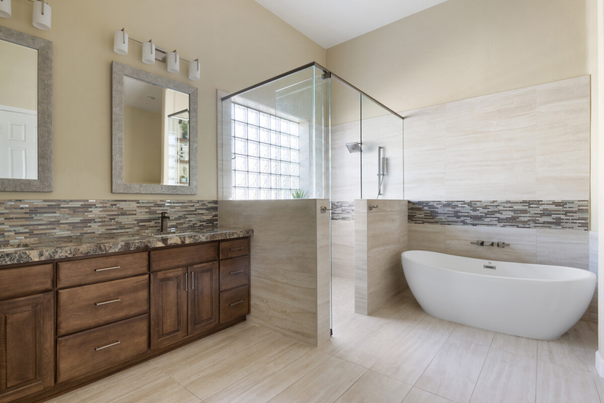
This kitchen and primary bathroom remodel was a gift to our client’s wife. She loves to cook and always wanted a double island in her kitchen. Knowing we were keeping their existing kitchen cabinetry, we had the island cabinets custom-made to match. To make these new islands even more unique, we designed one of them to have a double waterfall edge and incorporated two different stone slabs. The primary bathroom has a more serene, spa-like energy, which was what our client’s wife always dreamed of. We flipped the original configuration of the bathroom to make more room for a large shower and free-standing tub. Needless to say, our client’s wife was blown away and we hope she enjoys her favorite spaces for years to come!

Penny Lane

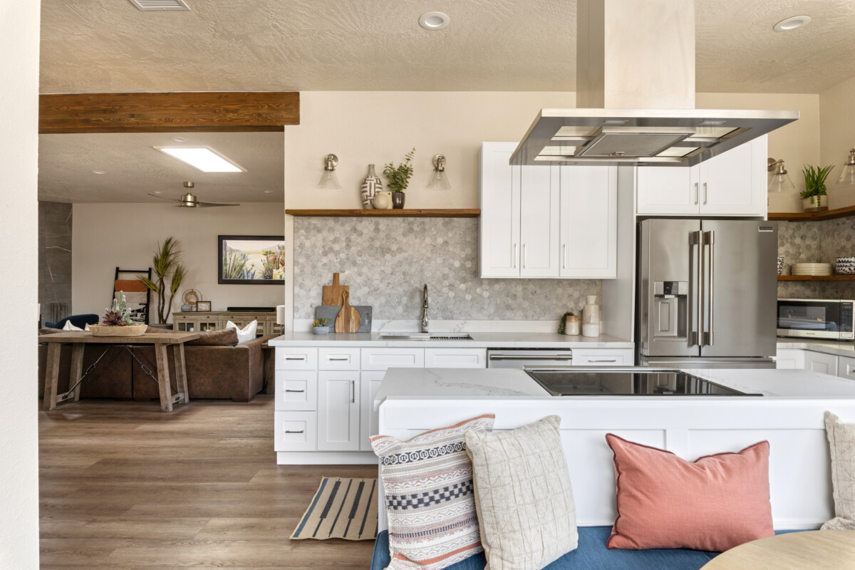
This beautiful Sedona home was originally purchased by our clients as a short-term rental investment property. We helped design the full home remodel and once our clients saw the design come to life, they fell in love and made this their forever home. In the remodeling process, we completely relocated the entrance to create more functional space, and we turned the old-school sunken bathtub/shower combination in the primary bathroom into an enclosed wet room with a soaking tub, among other things. Because our clients decided to make this home their own, we then had the honor to help them furnish and accessorize their space. We have known these clients for two years and have done numerous projects with them, so picking out furnishings and accessories in their style was fun and easy. They couldn’t be happier with their home, and neither could we!

Wabi Sabi Treatment

When our hypnotherapist told us she was moving into a new office and wanted it to promote serenity and healing for her clients, we enthusiastically offered to help. We have always desired to design a Wabi Sabi space, so when we learned that her favorite style is Minimalism with Japanese influence, we knew it was a perfect match! Bringing organic elements and warm tones into the space helped bring comfort to an otherwise bare and industrial space.

Cerulean Escape

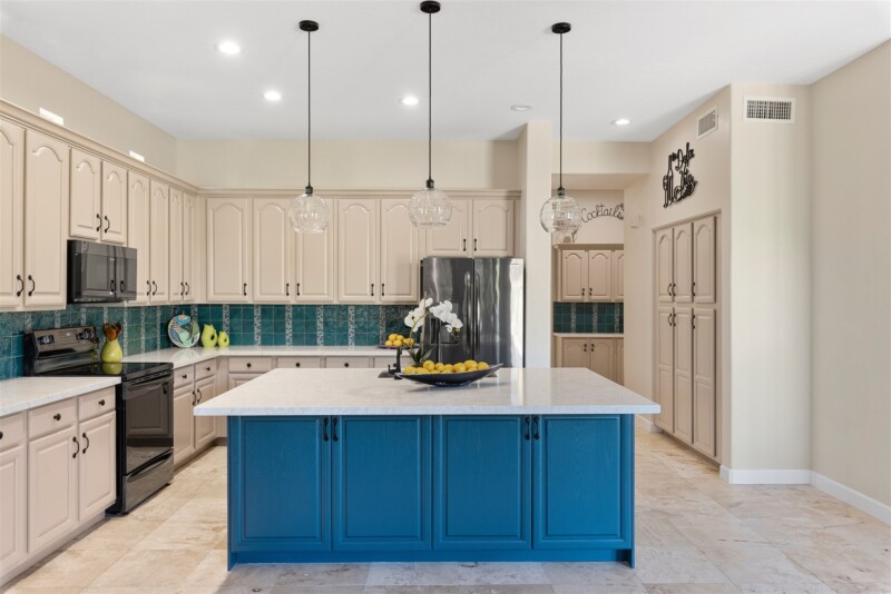
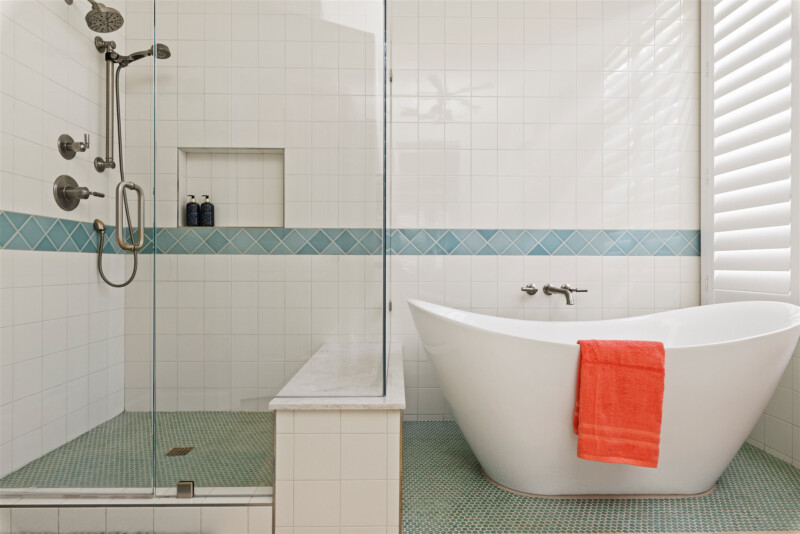
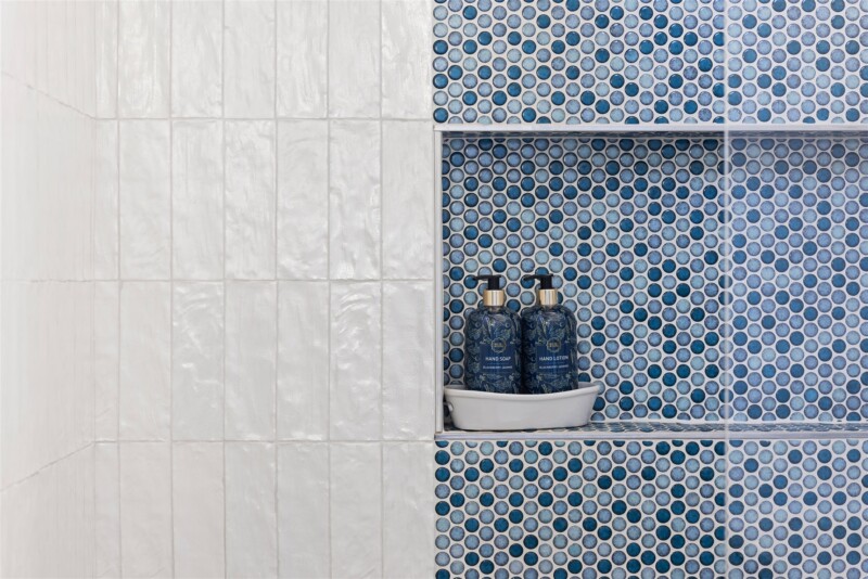
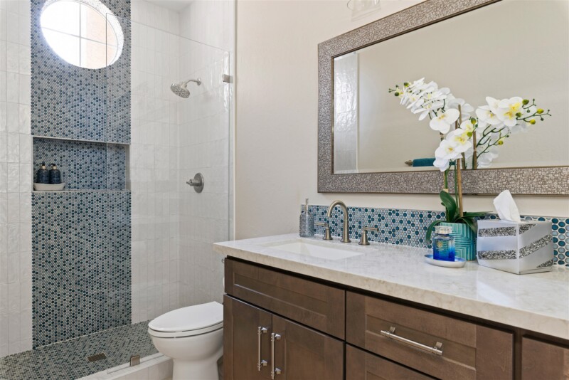
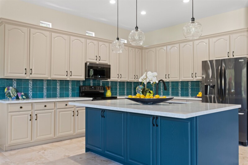
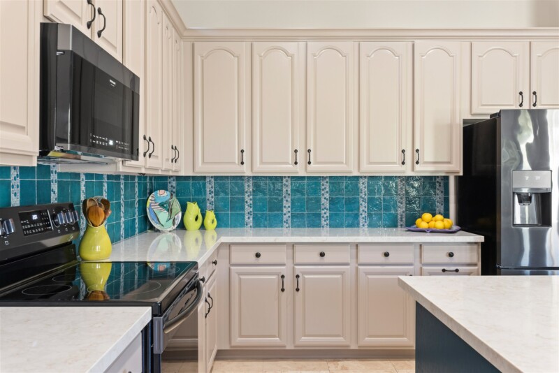
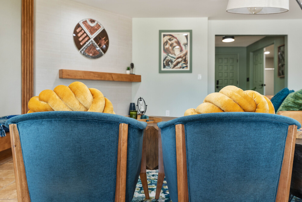
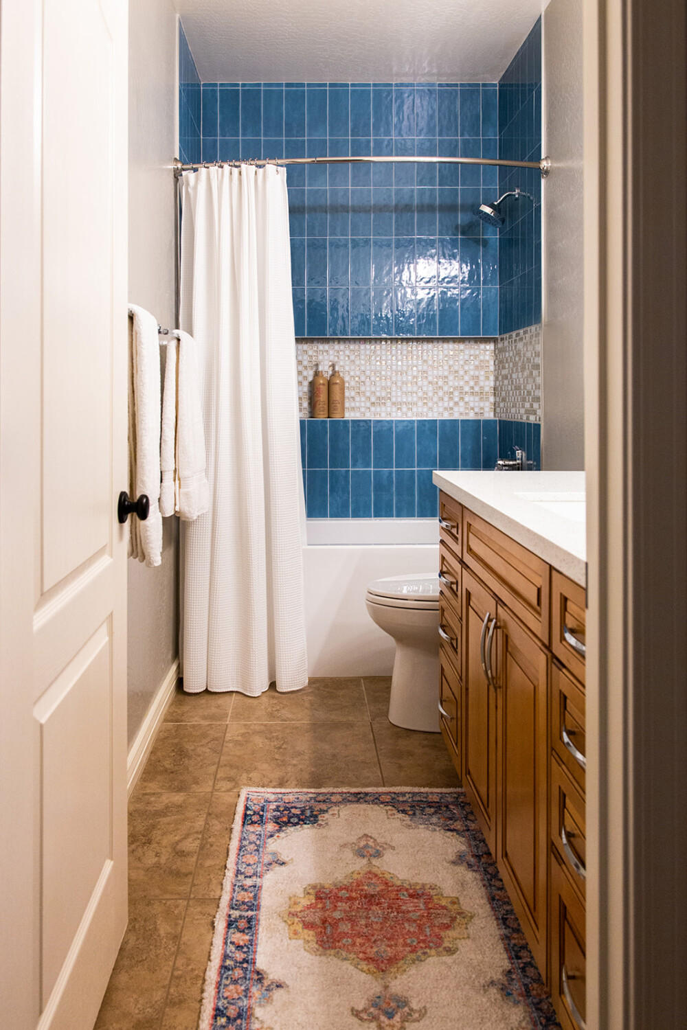
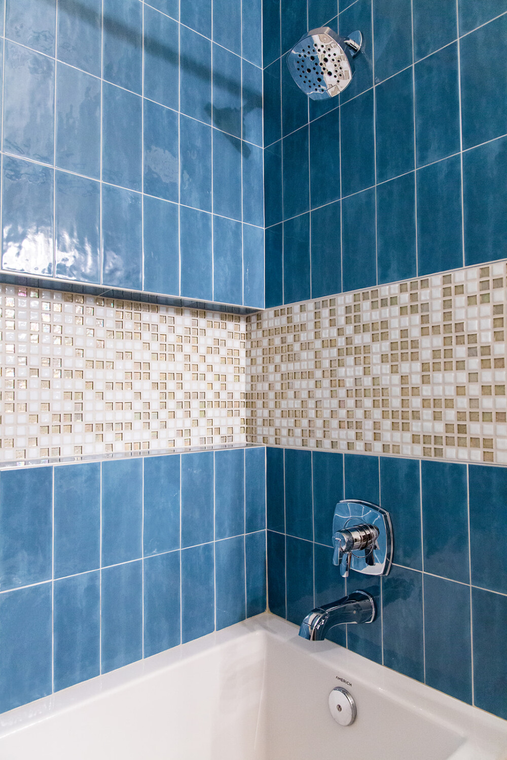
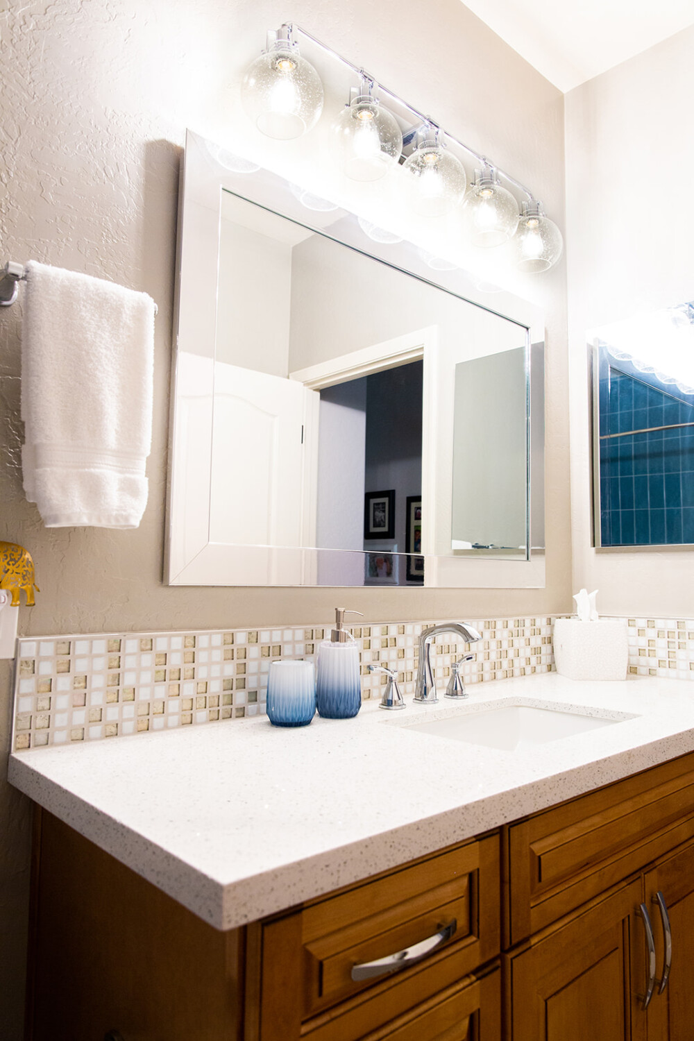
Step into this retro cerulean home. Blues are a statement throughout the home as our clients are playful and colorful. When sourcing materials for this home, we kept that in mind. They wanted a home that felt as if they were back in the 1920s. We incorporated modern materials and fixtures with a retro flare while still staying true to the architecture of the home. In the guest bathroom, the curvature of the window inspired us to make it a pronounced feature. The kitchen island used to be oddly shaped and had a bar section the clients wouldn’t use. We reconfigured the entire island shape and switched its direction for more functionality and beauty.

Windstone Glam

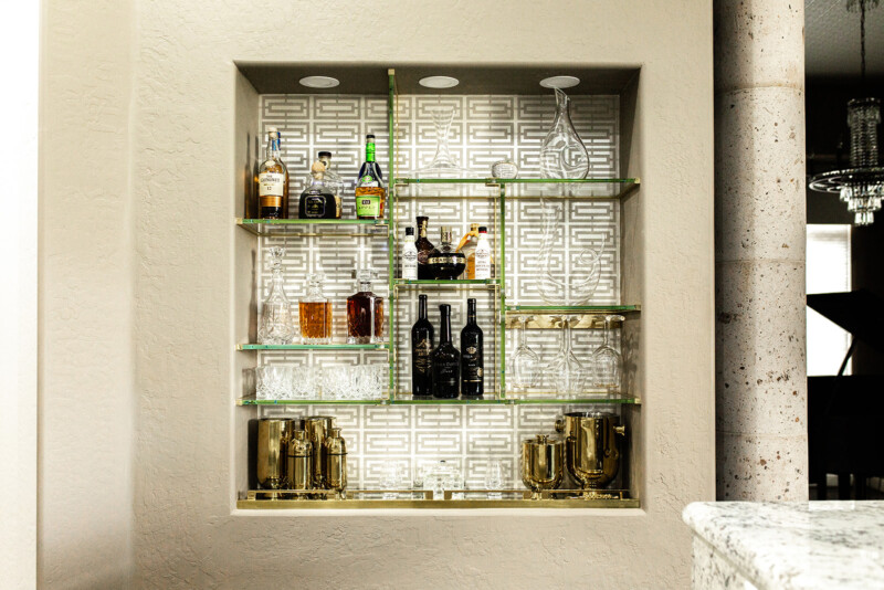
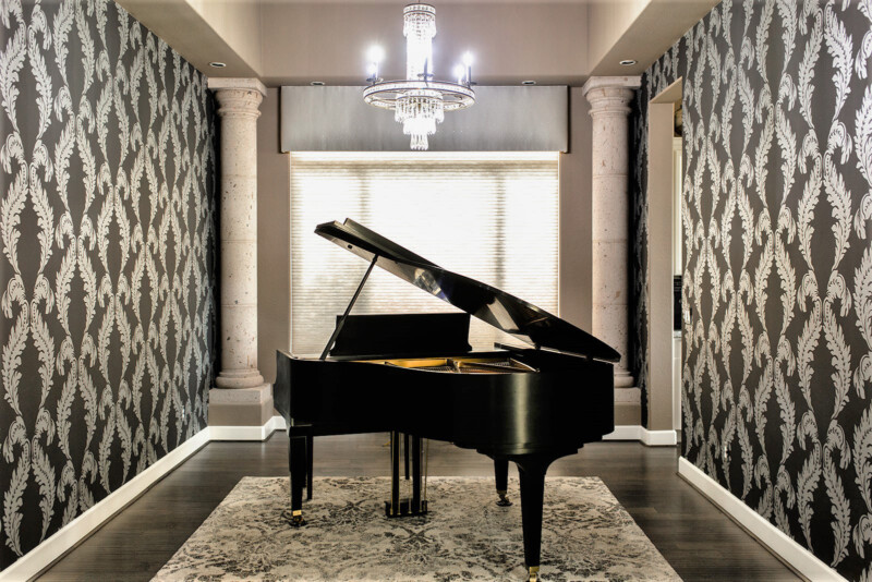
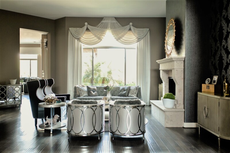
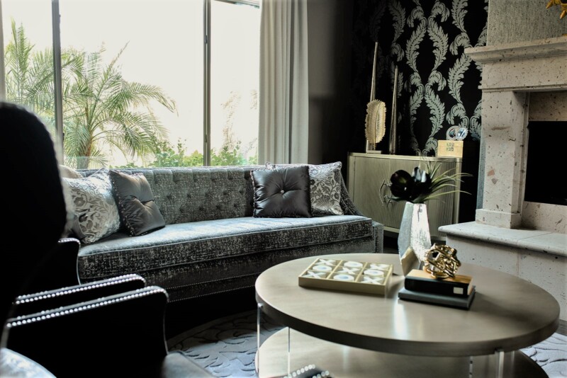
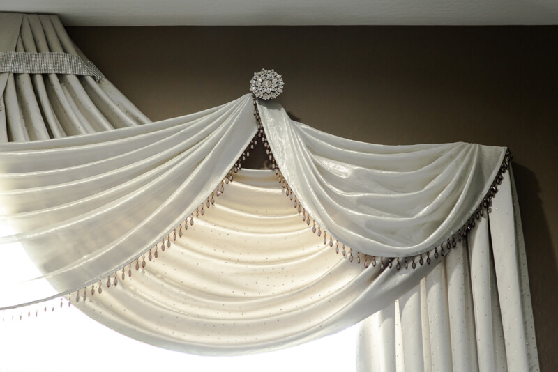
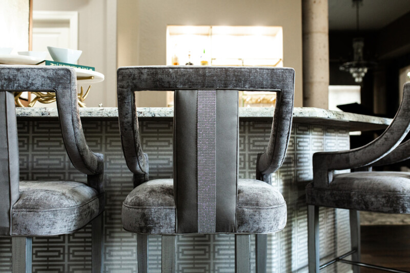
Regal meets monochromatic Hollywood glam in this contemporary Cave Creek home. It was built with modern farmhouse finishes, which didn’t match our client’s aesthetic. Our challenge was to keep some of the original finishes, such as the flooring, paint color, and lighting, and still achieve our client’s desired vision. This project was fun for us to design as we could be extremely audacious and creative. Our favorite element of the home is the use of three different wallpapers in one space to juxtapose yet complement each other.

Dalia

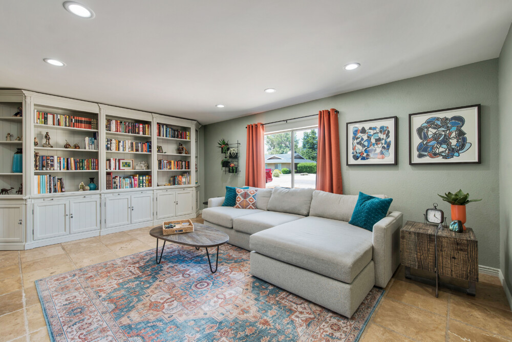
This space was designed for two creative people that, through their worldly travels, have curated unique and interesting pieces that became focal points for the design. We deeply understood the homeowner’s lifestyles and how important their careers in the copper industry are to them. This inspired us to incorporate an eclectic color palette with the use of copper art pieces while maintaining a modern aesthetic. To personalize the home more, the homeowner is a woodworker and made all the wood pieces that went into the design. We are super lucky to have such talented and amazing clients!

The Bonita Bathrooms

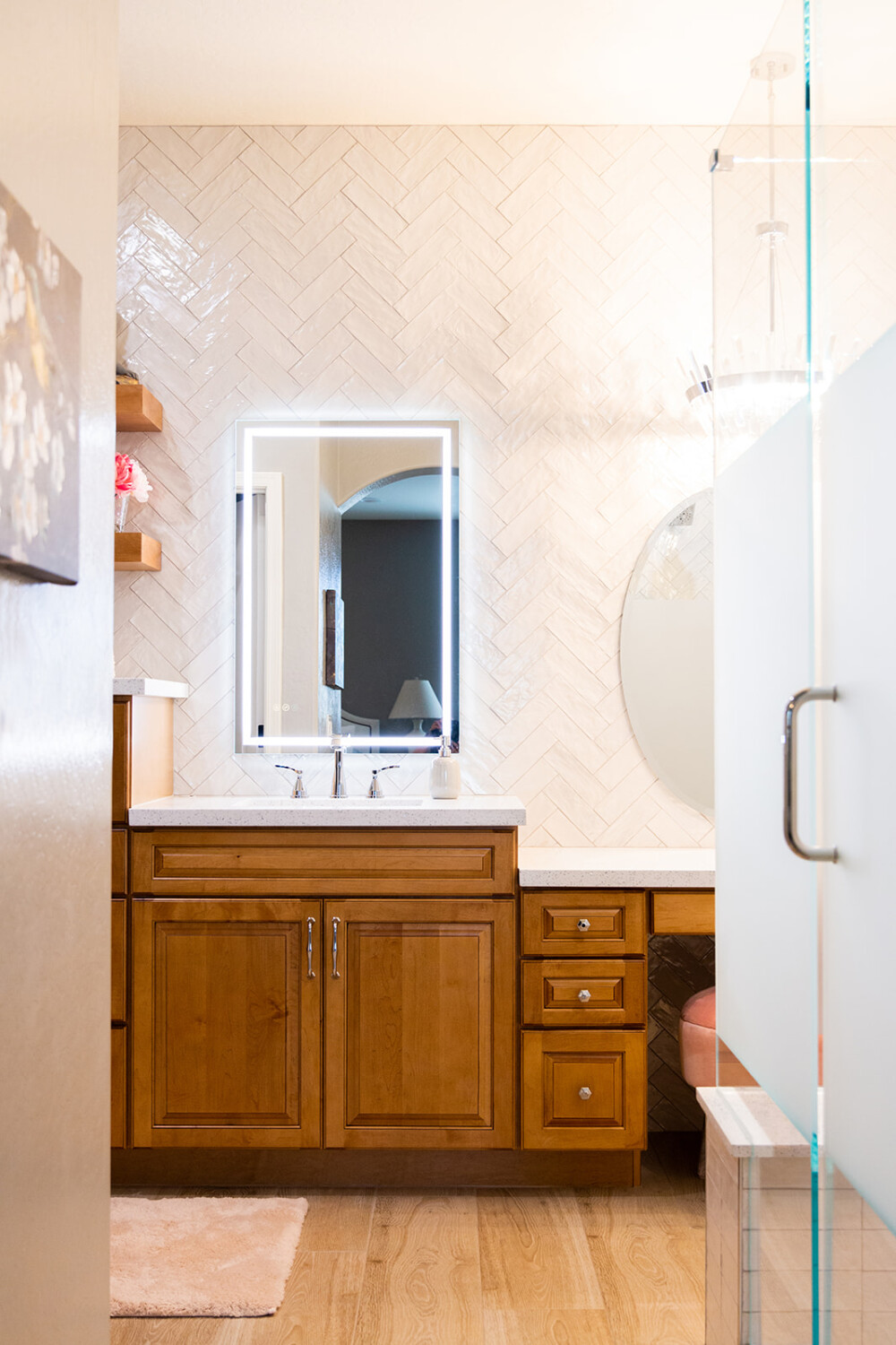
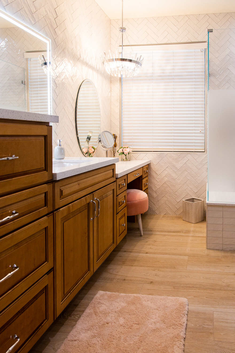
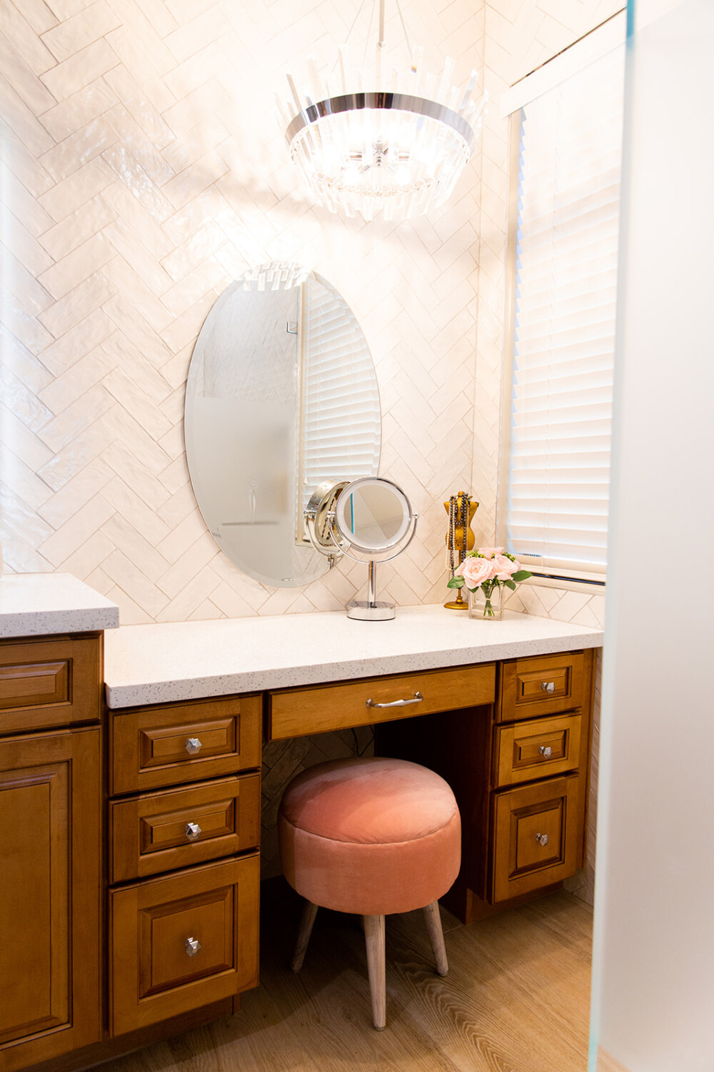
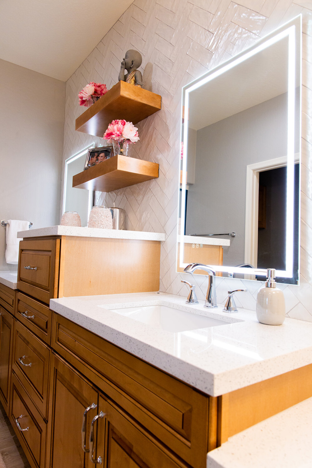
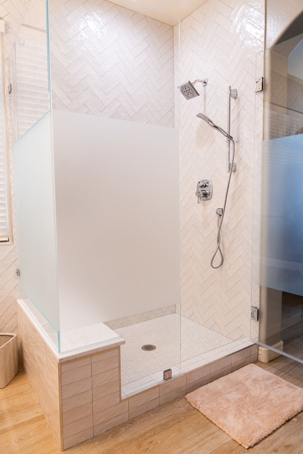
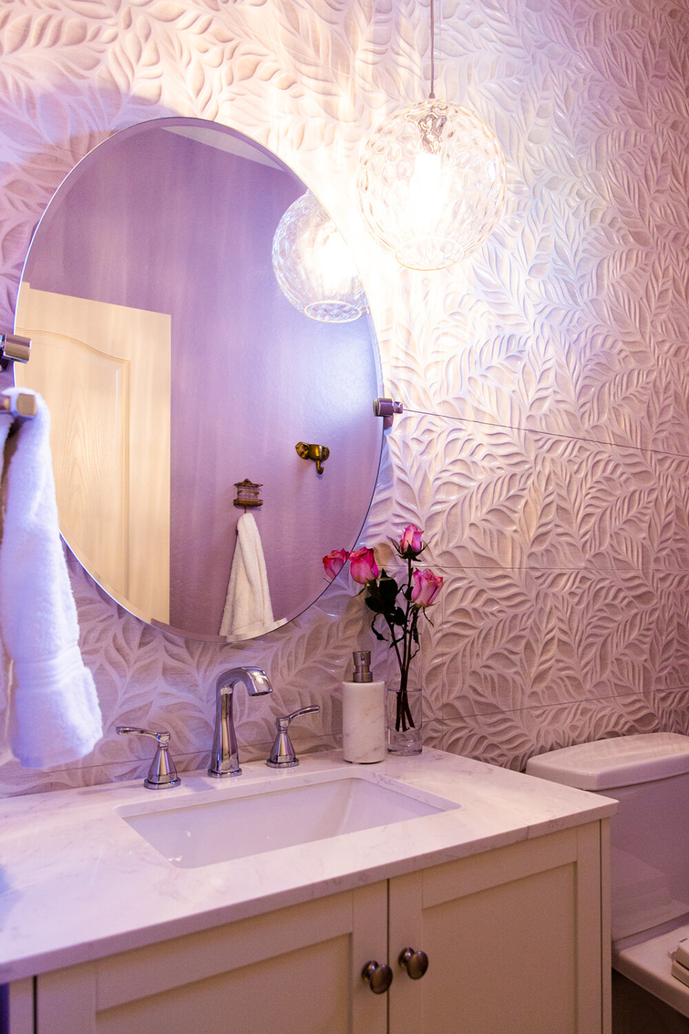
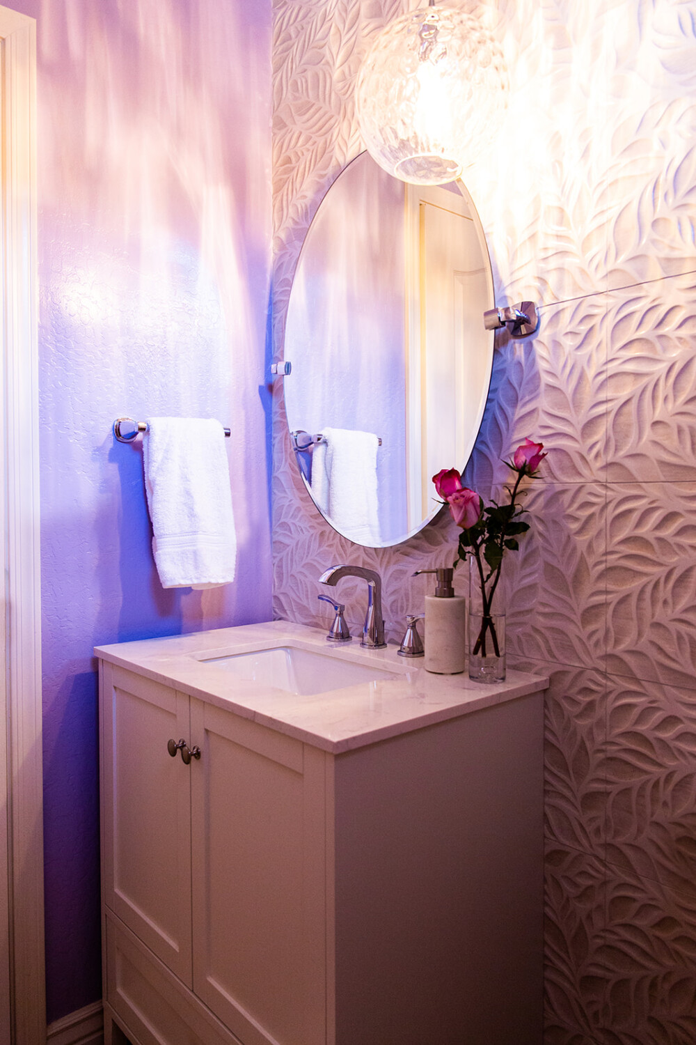
The primary bathroom was designed to be a kid-free sanctuary. Removing the tub and elongating the cabinetry allowed our client to have a makeup vanity, which was one of the most important things to her in the design. We chose light-toned tile and warm woods to make the space sophisticated and timeless. The guest and powder bathrooms are whimsical and fun to reflect their kids’ personalities while remaining refined. Every detail matters. We take pride in listening to our client’s desires. This can be seen through the cohesion of the lighting styles in each bathroom, which are feminine and blingy.

Helena

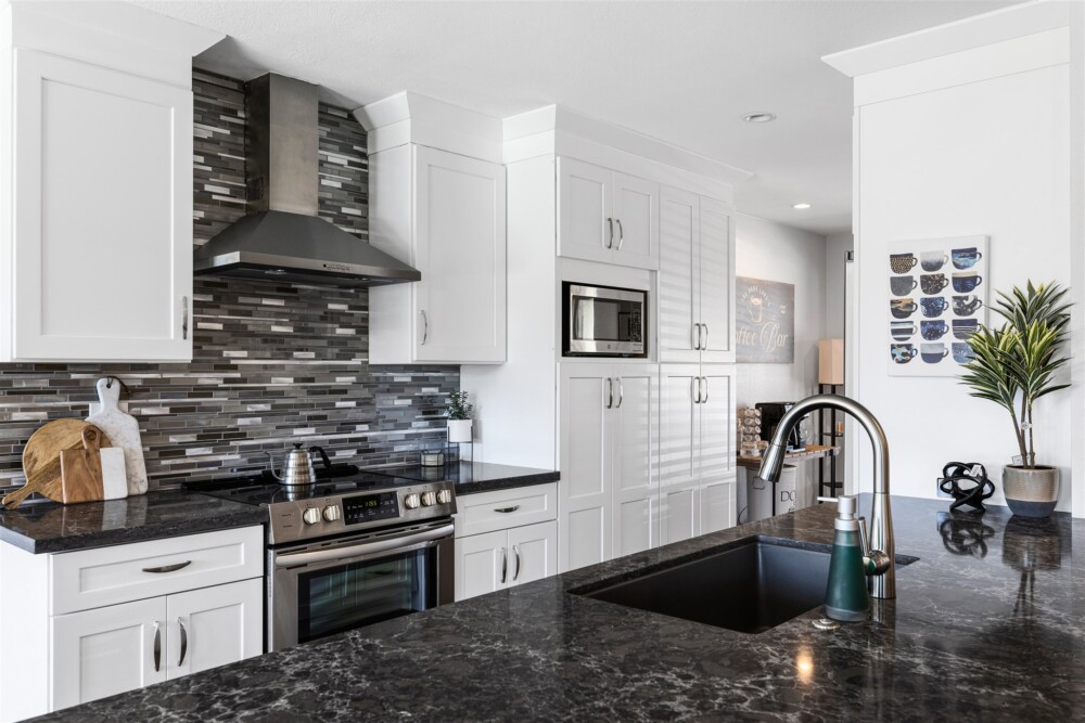
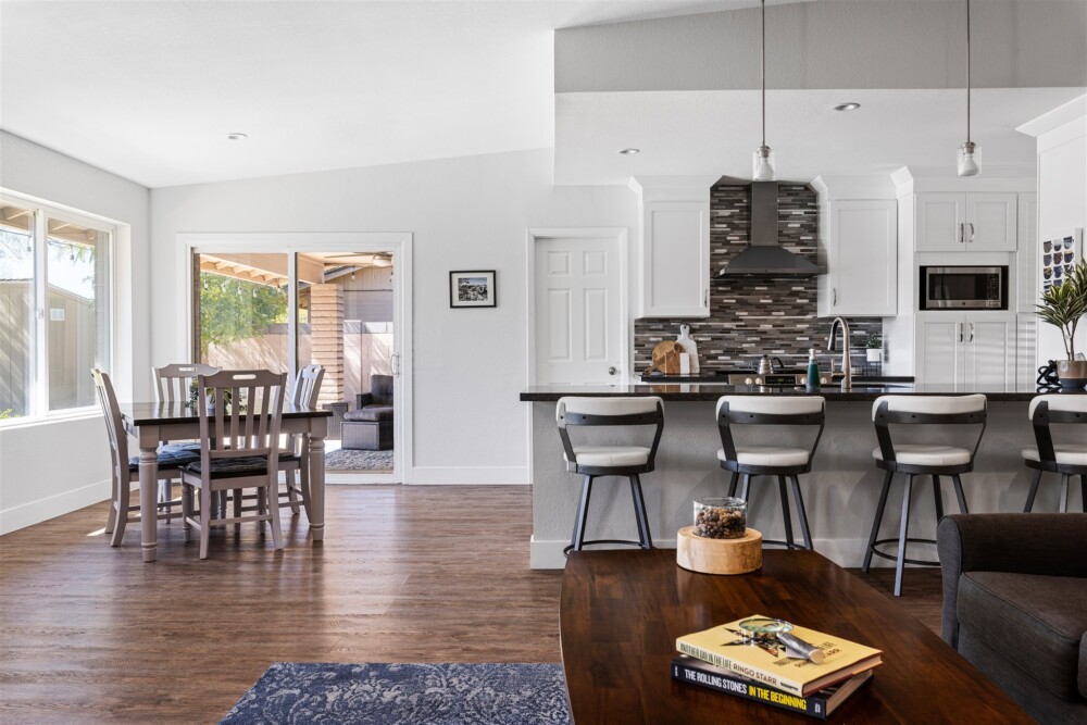
This bachelor wanted a unique aesthetic with a high-contrast color palette of black and white. Our construction knowledge was key in creating this design. In the kitchen, we knocked a wall down and raised the ceilings with the help of our amazing contractor. This construction aimed to create an open concept for our bachelor, who loves cooking, to be in the kitchen but remain a part of the fun during his many gatherings. We reconfigured the layout of the kitchen to be completely customized to our client’s need for functionality.

Let's chat about your design dreams!

Subscribe to our newsletter!

"*" indicates required fields
First Name
This field is for validation purposes and should be left unchanged.